YouTube’s Cosmic Panda Sucks!
I played with the YouTube’s Cosmic Panda UI for a while. I am not happy about it.
YouTube has a new experiment: Cosmic Panda. They test new channel and watch page experiences. I’m opting out — here’s why.
Watch Page
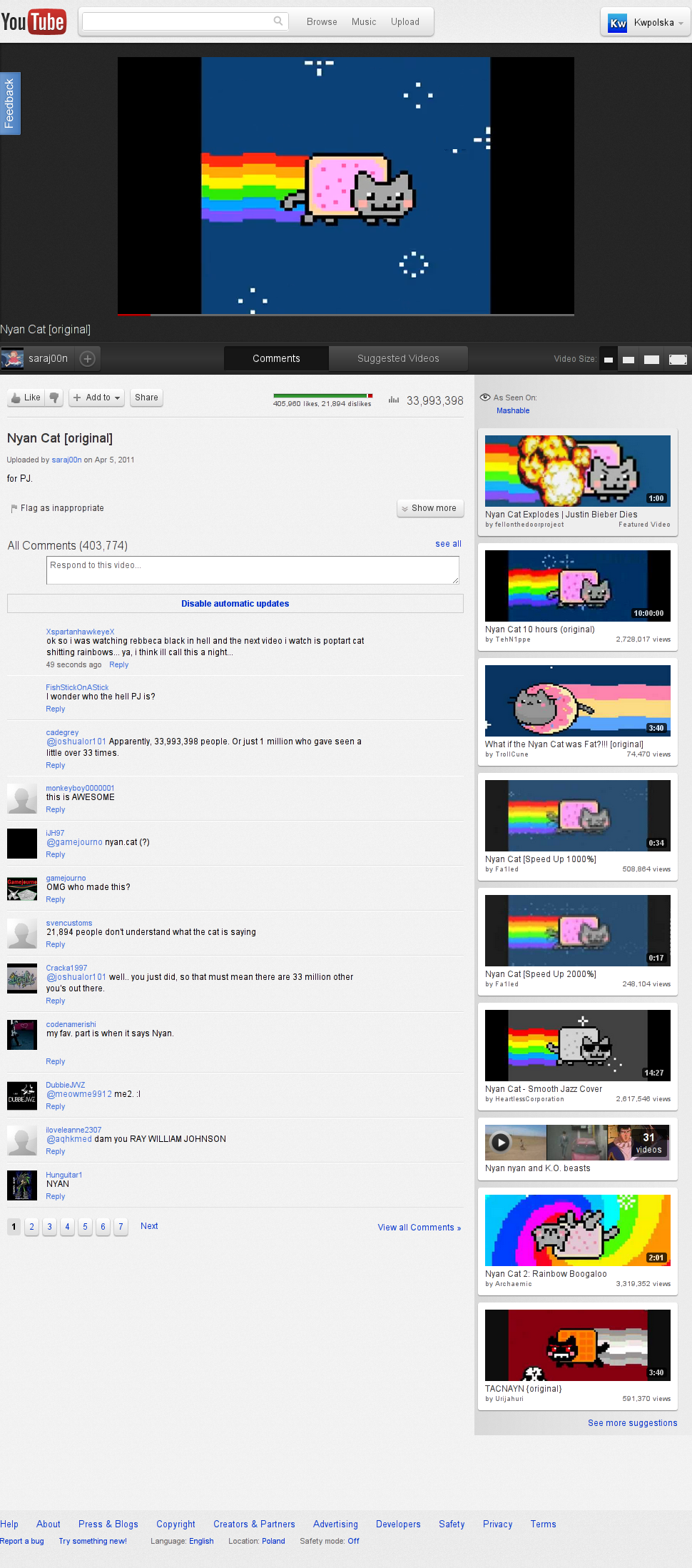
Let’s try watching a video, pretty much anything would work. The opt-in page suggests Nyan Cat, so let’s watch it.
Some things don’t work well, though:
Flash Player hides controls when playing
-
Video Size:
Doesn’t adjust the size of the current video, but adjusts the next ones you choose
Makes it impossible to use controls in mode 4 (window size)
Thumbnails on the right don’t open in a new tab when clicked with the mouse wheel
-
Comments:
Some avatars don’t show up
The dislike button was hidden when the project started
That’s all I can see, but I guess there are more flaws.
Playlist Watch Page
YouTube suggests a playlist of Rickrolls. Great. Or not. The UI has more flaws!
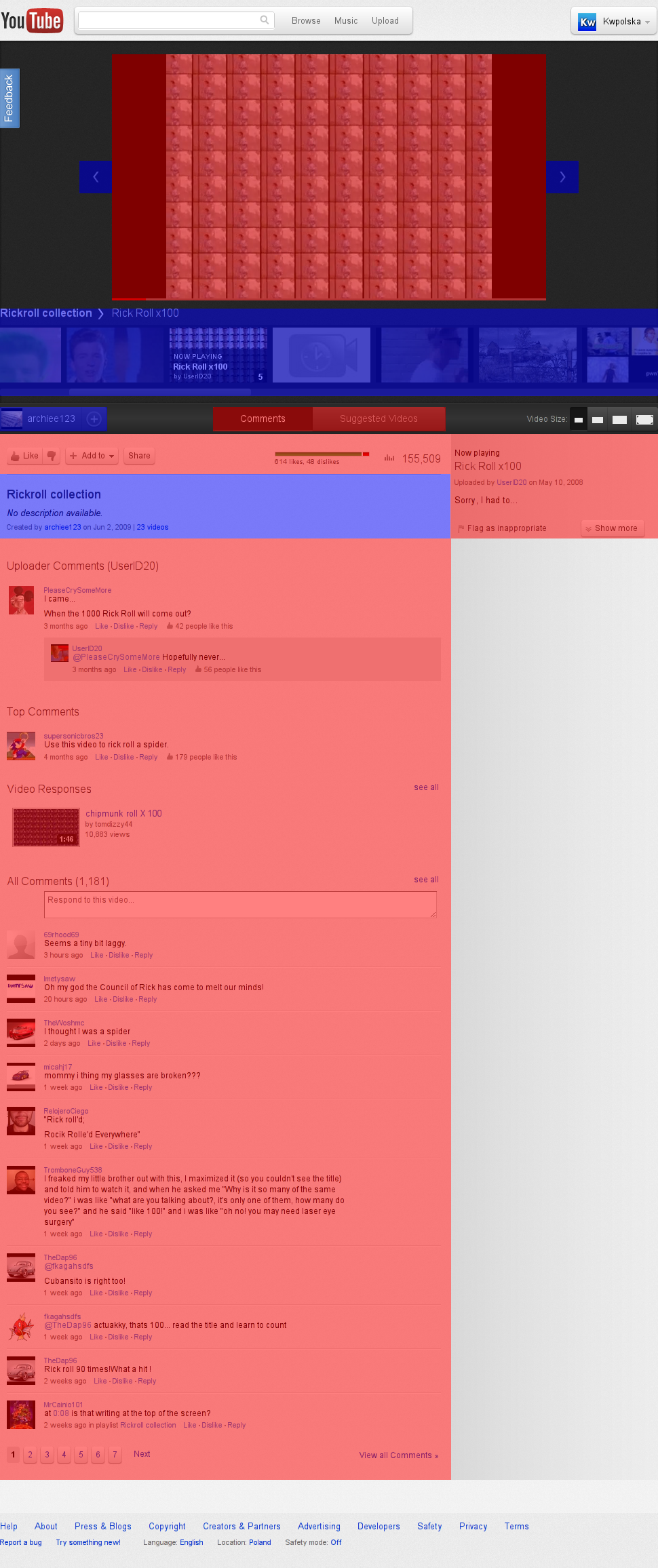
The flaws? I’m sure about two: you can’t stop the playlist from advancing to the next video and the content is not organized nicely. Take a look at the image #2. Blue = playlist content. Red = video content. That’s a total mess! Did they do any usability tests? I don’t think so. The “old” YouTube, for comparison, has a bottom panel with all playlist videos. Everything else belongs to the video. Readable and human-friendly.
Channels

I almost forgot about channel view. This time I will advertise and jump to Kikoskia’s Channel (sorry for covering the background on screens).
In case you’re wondering, the Videos tab shows playlists and the Community tab shows new videos, channel comments, etc. There is one problem: every video link sends you to a playlist. In order to get out of the playlist, you need to modify the URL. It would be great if I could see the channel background.
YouTube, remove these not-so-great fetures NOW.